What's new for the Microsoft Fluent UI Blazor library 4.7
With this release we don't have any new components to present to you. We do however have a nice set of new features, new parameters and fixes. A complete overview can be found on the What’s new page in the demo and documentation site or in the repository on the Releases page.
Breaking change
Albeit a very small one, there is a breaking change in this release so please be aware.
To avoid conflicts with existing methods in other libraries, we've decided to place all our extension methods in an Extensions (sub)namespace.
This is a minor breaking change. If you run into this, you just need to add an new using statement for the new namespace to fix any errors. See the Upgrade Guide for more information.
New features and parameters
- Calendar and DatePicker: corrected the way months and days are calculated, and added a
Viewparameter to theFluentDatePickercomponents. - Grid: new
AdaptiveRenderingproperty. - Wizard: new
StepSequenceattribute. - DataGrid: Ability to clear the existing sorts; Addition of
Widthto Columns component; And improvement ofSortBy. - MenuButton: Added
ChildContentto improve content customization. - Popover: Added
FixedPlacementto solve certain positioning problems. - PullToRefresh: Added
DragThresholdto specify a threshold distance before showing a tip.
Calendar and DatePicker
We have completely overhauled the way months and days are calculated to be able to support many more “Cultures” (e.g. fa-IR) than we did before.
<FluentCalendar Culture="@(new CultureInfo("fa-IR"))"></FluentCalendar>
Using the above could result in something like: 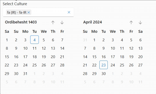 See the example in the demo site to try out many more cultures.
We also added the option to use the DatPicker as a month or year selector.
<FluentDatePicker View="CalendarViews.Months" />
<FluentDatePicker View="CalendarViews.Years" />
Which will give you: 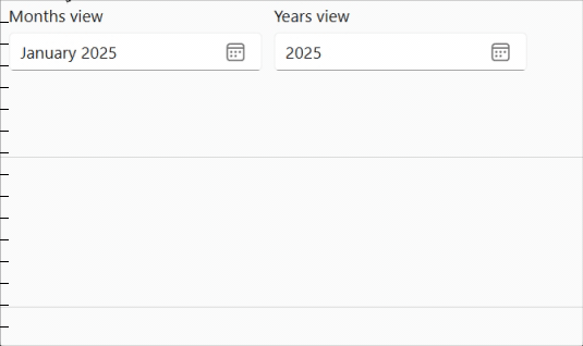
Grid
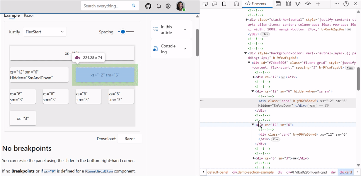
We’ve added a new AdaptiveRendering parameter to the FluentGrid component.
AdaptiveRendering allows you to not generate the HTML code of the FluentGridItem based on the HiddenWhen parameter value. In other words, when AdaptiveRendering=false (default), the contents of a FluentGridItem is simply hidden by CSS styles, whereas if AdaptiveRendering=true, the content of the FluentGridItem is not rendered by Blazor. Obviously this need interactivity so his will not work when using SSR.
This addition helps to improve efficiency and performance by not sending/rendering content where constucting the content is expensive or time consuming.
<FluentGrid AdaptiveRendering="true">
   ...
</FluentGrid>
Wizard
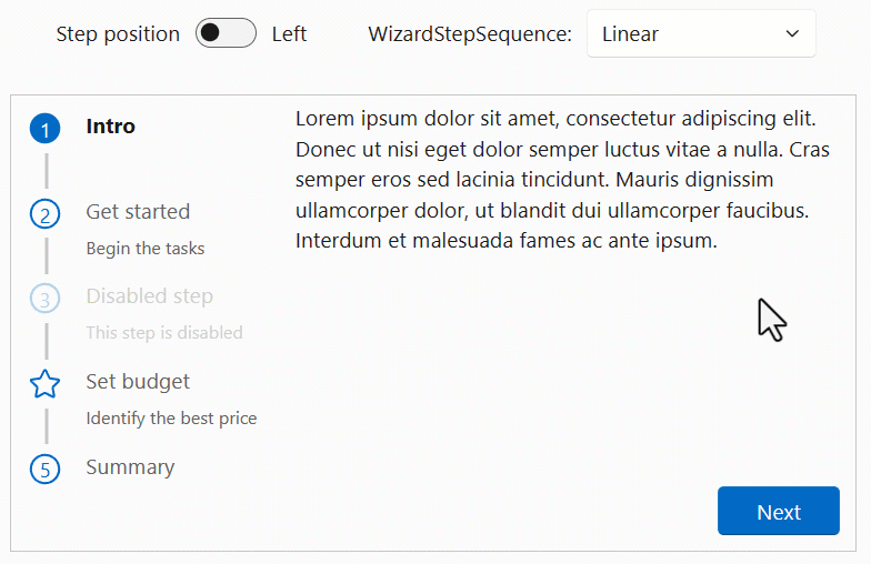
We added a new StepSequence parameter to allow direct access to previous steps or to all steps in a FluentWizard component.
The possible values (enum) for this parameter are:
- Linear : The user can only access the next/previous step using the Next/Previous buttons.
- Any: The user can access all steps by clicking on an item.
- Visited: The user can move on to the next step using the Next button, or go to any previous step already visited.
Of course, only non-deactivated steps are accessible.
We preserve the previous behavior by making the default mode
Linear.
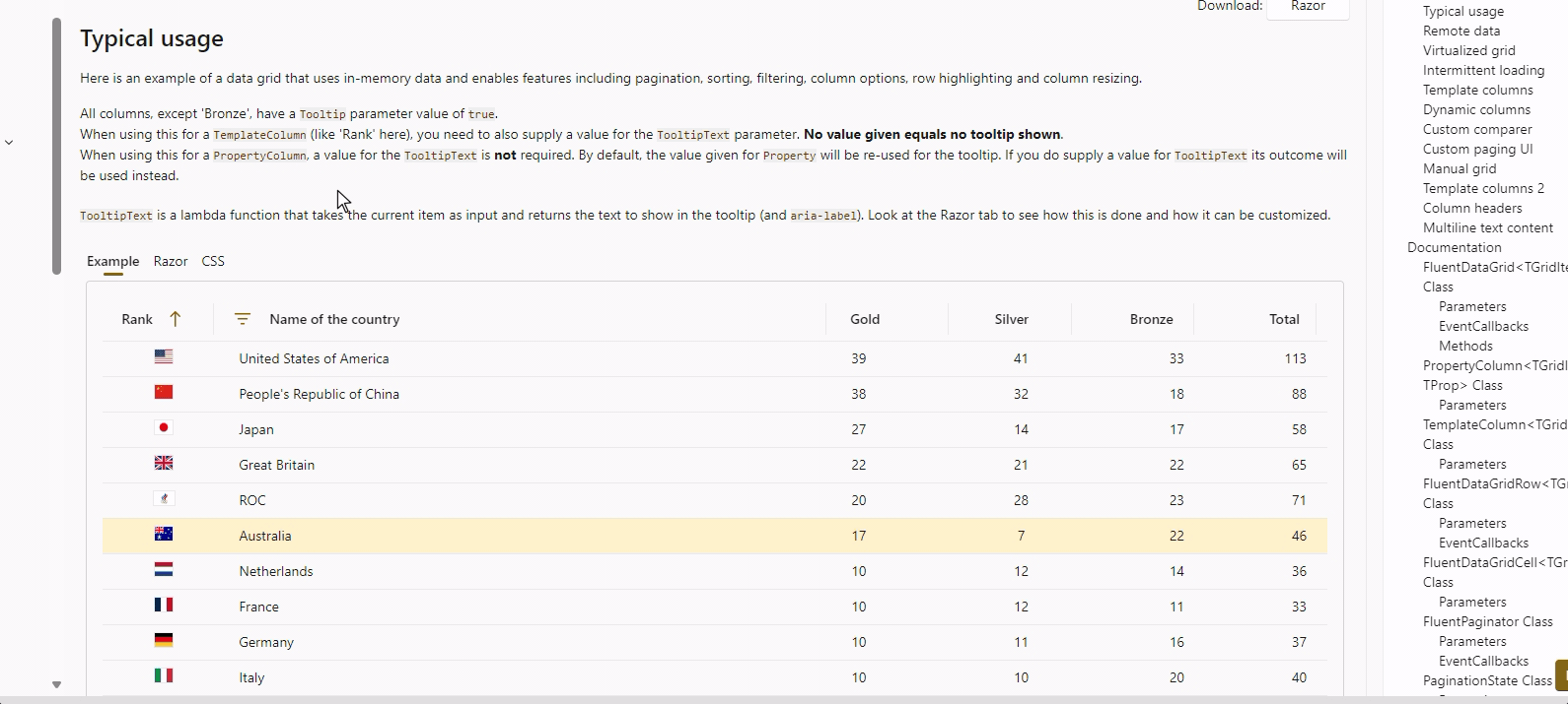
DataGrid
We enhanced the FluentDataGrid in a number of ways:
- Added the option to clear a previously set column sort
- Allow for
Widthto be specified on the column level - Allow
SortByto be specified onPropertyColumn's - Allow resizing columns by using the keyboard
Clear sort
Previously, when a sort was applied on a column (by clicking the header button), there was no option to remove the sort. It is now possible to right-click (or use Ctl+Enter) on the column header to delete the sort and restore the default situation. Obviously this can not be used to clear the default sort of a DataGrid
Column Width
It is now possible to define column widths using a new Width attribute when defining columns. When specifying widths on a column level, these values will be used to generate the DataGrid's GridTemplateColumns parameter. You can choose to use GridTemplateColumns OR Width to define column widths but not both.
Example:
<FluentDataGrid Items="@people">
    <PropertyColumn Width="100px" Property="@(p => p.PersonId)" />
    <PropertyColumn Width="50%"   Property="@(p => p.Name)" />
    <PropertyColumn Width="50%"   Property="@(p => p.BirthDate)" />
</FluentDataGrid>
SortBy
Previously, the PropertyColumn did not support the SortBy parameter. It is now possible to provide a default sorting configuration, adding the ability to define a custom implementation of SortBy. For more details see the PR in the repository
Resizing columns
To improve the accessibility of the DataGrid, we enabled resizing of columns through the keyboard. (Obviously, this only works for grids where the Resizable parameter has been set to true.)
You can use the + and - keys to resize the column the focused header belongs to. Incrementing and/or decrementing the width is done in steps of 10 pixels at a time. You can reset the grid to it's original initial column widths by pressing Shift + r.
MenuButton
A ChildContent parameter has been added to the FluentMenuButton component. This makes it possible to manually supply FluentMenuItem children and thus use all menu item's parameters (such as Disabled).
Popover
We’ve added a FixedPlacement attribute to the FluentPopover component to resolve certain positioning problems. This value indicates whether the region is positioned using position: fixed. or uses position : absolute. Fixed positioning allows the region to be independent of parent containers.
PullToRefresh Request
To avoid starting to display the “Tip” of the PullToRefresh component immediately, the new parameter DragThreshold hides the “Tip” until it has been pulled to at least DragThreshold's value in pixels.
Other fixes and changes
- AppBar: Apply “role” requirements (a11y) #1871.
- Input NotifyFieldChanged was called twice for all
FluentInputBasederived components #1846 - Paginator spelling issue in
FluentPaginator.razor.cs#1829 - Select Allow value to be set when component is disabled #1892
- Slider Fixes thumb redraw issues #1873
- Wizard Fix the Wizard bullet number style #1905
Icon updates
We updated to the Fluent UI System Icons release 1.1.237. This brings in the following additions and changes:
What's new (Name / Size(s) / Variant(s))
- Book / 48 / Filled & Regular
- Camera Arrow Up / 16, 20, 24 / Filled & Regular
- Chat Settings / 16 / Filled & Regular
- Circle Highlight / 20, 24 / Filled & Regular
- Circle Hint / 24 / Filled & Regular
- Circle Shadow / 20, 24 / Filled & Regular
- Content View / 16 / Filled & Regular
- Double Tap Swipe Down / 16 / Filled & Regular
- Double Tap Swipe Up / 16 / Filled & Regular
- Flash Sparkle / 16 / Filled & Regular
- Location Ripple / 12 / Filled & Regular
- Search Square / 16 / Filled & Regular
- Settings Chat / 16 / Filled & Regular
- Share Multiple / 16, 20, 24 / Filled & Regular
- Slide Play / 20, 24 / Filled & Regular
What's updated (Name / Size(s) / Variant(s))
- Book Add / 28 / Filled & Regular
- Book Contacts / 20, 24, 28, 32 / Filled & Regular
- Book / 28 / Filled & Regular
Previous version
We backported a bunch of these changes and additions to the previous version again as well. Please see the What's new? page on the v3 demo and documentation site. The v3.6.2 packages are available on NuGet
Thank you!
A special thanks goes out to these first-time contributors:
And, of course, we also thank all our other contributors for their fixes, changes, enhancements, comments and suggestions.
Let's keep working together to make this a great Blazor component library!
Comments
Comments are closed